Typography Poster, Festival
For this poster I did not use any images, but instead allowed the text to speak for itself. To accomplish that goal, I established text hierarchy, used a direct color pallete and limited number of typefaces to create my Albuquerque Balloon Fiesta Poster.
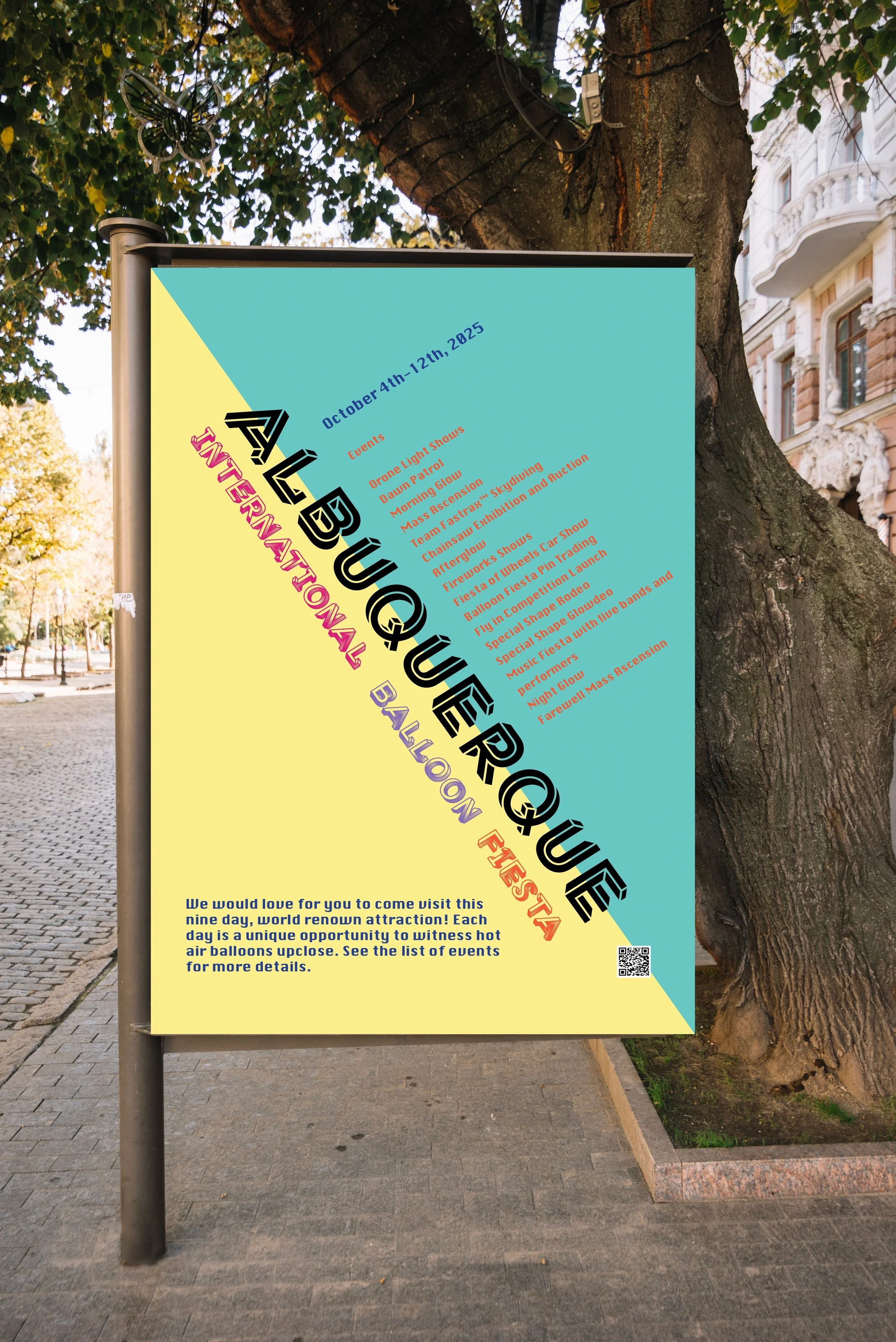
The original design lacked structure, and balance with the typefaces. I tried to pack too much information on the Poster without breathing room. My new design uses a complete revised layout, to ensure that the proper text is highlighted. Additionally I altered my color palette to establish a softer, more inviting tone.
Before

After
